 Before I find out what my target audience will be I must first find out what the target audience of grime is. Radio one Extra is the "holy grail" of grime, and they target their audience particularly to the younger generation of older teens to younger 20 year olds, so this is what my target audience will be mainly. My target audience will need to relate to both the language used in my magazine, of an informal or "street" register, and also relate to the music the magazine is about and the artists themselves, so that they have a sense of relief that there are others going through similar struggles as them. For this reason I would target young people, predominantly males, from rough backgrounds who are going through some form of struggle however I will also try and get female interest as well, this is what grime is targeting, which is why it is so popular in big cities like London, my ideal readers feel grime music as a religion and a way of life, it is more than the music and beats, it has a bigger and deeper meaning that many of the rough and inner city kids can relate to, so this is what I would like to mimic for my magazine.
 Tuesday, 13 December 2016
Ideal Reader
Before I find out what my target audience will be I must first find out what the target audience of grime is. Radio one Extra is the "holy grail" of grime, and they target their audience particularly to the younger generation of older teens to younger 20 year olds, so this is what my target audience will be mainly. My target audience will need to relate to both the language used in my magazine, of an informal or "street" register, and also relate to the music the magazine is about and the artists themselves, so that they have a sense of relief that there are others going through similar struggles as them. For this reason I would target young people, predominantly males, from rough backgrounds who are going through some form of struggle however I will also try and get female interest as well, this is what grime is targeting, which is why it is so popular in big cities like London, my ideal readers feel grime music as a religion and a way of life, it is more than the music and beats, it has a bigger and deeper meaning that many of the rough and inner city kids can relate to, so this is what I would like to mimic for my magazine. Friday, 2 December 2016
Best Magazine Covers


The Dixie Chicks appear naked on this magazine cover of Entertainment Weekly with phrases such as, "Boycott," "Traitors," "Hero," and "Proud Americans," written on their bodies. Two months earlier, member Natalie Maines criticized the imminent attack on Iraq by President George Bush at a gig in London. This statement sparked intense criticism from many Americans who subsequently boycotted The Dixie Chicks music and concerts. In their conference with Entertainment Weekly, the group discussed their reaction to the criticism and what may be in the future for them in the country music industry. This magazine cover is considered so great due to how the girls, stood up for themselves after criticism and its controversial side.
Monday, 14 November 2016
Colour Consumers
My colour scheme for my music magazine final design will predominantly consist of Yellows, Reds, Blacks and maybe Oranges.
Yellow - "The colour of youth". This bright vibrant colour represents optimism and youthfulness throughout nature and society. It is quite often used to grab attention of people window shopping. The main reason I've chosen to use yellow is because of its attractive nature and how it represents youth and life which ties into the genre of grime music.
Red - This colour very energetic and loud, it causes your heart rate to increase whilst also representing feelings of lust, anger, urgency and danger. It is commonly used in shops for clearance sales as it is so effective at grabbing your attention and many colours pop out when put over it. I am using this colour because of how its representations really reflect how grime is perceived and what it stands for and also a really good "attention grabber".
Orange - Considered the "tamer" red, this colour creates a call to action whilst also reflecting danger, aggression and flamboyance which all can come together to be used to describe grime music. It stands out brilliantly on a dark background and catches the eye of passers by.
Black - Powerful, sleek and mysterious. All of these elements are what the colour black shows and represents, and it is also commonly used in marketing to sell luxury products as unlike its simplicity it is nowadays seen as a colour which reflects relaxation and luxury. It is bold and outstanding when on lighter backgrounds which is the reason I have chosen it for my colour scheme, and as we all know, black goes with everything.
Monday, 7 November 2016
Worst Magazine Covers

What is simply awful about this cover? The photo. Not just the fact that it is Kristen Stewart, who is without a doubt one of the most unenthusiastic actors of this century, but the fact that this is reflected in her facial expression. She doesn't look enthused in anyway and her body language is hunched over and arms drooping by her side which just tells the reader that she just doesn't want to be there, whether or not this is on purpose as the sub heading reads "Drama Queen", it could be seen as an ironic heading or it just could be awful magazine design. In my magazine cover I will try to make the subheadings relevant to the main image and try to make that image look somewhat intriguing, relevant and exciting.

In my magazine I will make sure that I choose a colour scheme that compliments the style and genre of the cover well, I will choose an intriguing and clean layout and try to come up with relevant and original sub-headings.
Monday, 10 October 2016
National Reading Survey
"The National Readership Survey was established in 1956 and today offers the best authoritative and respected audience research in use for print and digital advertising trading in the UK. The survey covers over 250 of Britain’s major news brands and magazines, showing the size and nature of the audiences they achieve."
This table shows the ages of the readers for some of the most popular music magazines' that are sold in the UK.
(click to view)

How is this data useful to you in creating a music magazine?
These statistics in this table is beneficial for different
genres of music magazines as it displays what category of people their
magazines suit and are mostly bought by. It is also a method in which different
magazines can compare their reader status to other magazines because of the bigger
total of magazines bought. The use of the age groups shows which genre of music
magazines most suit specific age groups.
What does it tell you that something like the advertising packs do?
They are custom-made to the right genre which lets people
become more informed of what will be incorporated in the magazines that most
suit them and what they are attracted to when it comes to both visual and
content.
What more would you like to know?
I would like to find out if each customer frequently buys
the same magazine or whether the majority of the purchases were essentially
just one off buys and are not regular. I would also like to know if the person
who bought the magazine went back and read it again afterwards instead of
merely reading it once and never picking it up again.
The Four F's of Magazine Design
Format
They are the design choices that are repeated in every issue. These are used to define the magazines overall look and feel. Included are a logo, cover line, size of the magazine, department headers and other things that repeat in every issue.
Formal
It is the editorial content (eg: what is included in the magazine). This includes the type of articles, their length, departments in the back and front of the book (The same sections used in every issue of the magazine) all make the formula.
Frame
The frame is the standard size for outer pages, margins and also gutters. Majority of magazines use the same sort of margin width throughout the content of the magazine; others sometimes vary the width, using tall top margins for features to set apart the well, for instance. The rule for using margins establishes consistency from issue to issue.
Function:
What the magazine itself is trying to achieve and the message it is trying to send.
CONSISTENCY- Same issue each time.
UNITY- United feel to every magazine issue.
Tuesday, 4 October 2016
The History of Vibe

Vibe is an American music and entertainment magazine founded by producer Quincy Jones in 1992. The publication predominantly features R&B and hip-hop music artists, actors and other entertainers. After shutting down production in Summer 2009, Vibe was purchased by the private equity investment fund InterMedia Partners and is now issued semi-monthly with double covers, with a larger availability online. The magazine's target audience is predominantly young, urban followers of hip-hop culture.

The magazine has featured such cover stars like, Tupac, Dr Dre, Prince, Eminem, JAY-Z and many other well known faces from the hip-hop and R&B genre. In 2014, the magazine moved online-only. After its move to the internet the magazine has seen its views sky-rocket due to its increased availability and convenience to its target audience. Vibe is highly regarded as one of the first original hip-hop magazines and is still very popular today. It has become more relevant over the years and as hip-hop has evolved, so has Vibe.

Wednesday, 28 September 2016
Comparing Magazine Covers

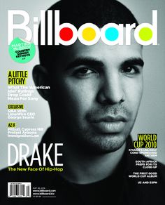
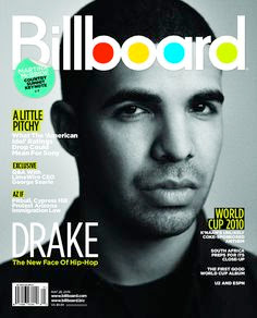
As you can see both of the magazine covers use the same cover star, Drake, and as both of these magazines have two very different target audiences and different genres, they both use Drake because he can be viewed as both a pop star and a rapper. It is all about perspective, whether you view him as either an artist of pop or hip-hop.
The way Drake is positioned is reflected by the genre of the music magazine, for example, on the Vibe cover he is wearing a hat that is off-centred and has a posture that promotes him as a person who is more of a rebel and wont conform to societies rules, which is what hip-hop and rap is all about, expression and rebelling. Whereas on the cover of Billboard, which is more of a pop culture magazine, has a close up of him and shows him more in a plain way without any accessories, this is because they want their audience to see him as a less threatening idol than the way he is portrayed on Vibe.
Monday, 26 September 2016
Music Magazine Cover

The cover for this particular magazine seems to be very traditional in the way it is laid out. For example the main image is in the centre, it is quite large and partially covers the masthead, the subheadings are also placed on either side of the image, this is common for music magazines. I quite like this because this idea of keeping with tradition contrast well with Eminem as he is seen as quite a rebel who doesn't follow the norms of society.
This conveys the genre as hip-hop and rap is meant to be quite rebellious and different so this contrasts with the layout well and the use of Eminem as the centre image represents all that is rebellious and outgoing about the culture and genre of rap.
In my design i would like to use the traditional layout because i feel like it works the best and is the most visually appealing to my audience. However this may change as I do more and more research.
Thursday, 22 September 2016

Music Genres - Grime
 Grime is a genre of music that emerged in East London in the early 2000s. It is primarily a development of UK garage and jungle and can represent growing up on the streets of poorer London. Prominent artists that stylized this genre include JME, Ghetts, Kano, Lethal Bizzle, Skepta, and Wiley. In the last decade or so it has blown up across the country, and it is starting to get the rest of the world hooked on the unusual beats, fashion, beefs, and attitudes.
One of the most popular groups in grime, and one of the main reasons why it has gone so global in recent years, is Boy Better Know, or BBK as they can be known as. The group includes such artists as Skepta, JME, Wiley, Frisco, Jammer and DJ Maximum. They have played shows all over the country, like Wireless in London, Reading Festival, Red Bull Culture Clash and will soon be doing a tour in America. They have been influential in the Grime movement and continue to gain popularity as time goes on.
 There are many sub genres of grime, and freestyle is seen as one of the most entertaining for the listeners due to its unpredictability, catchy instrumentals, and deep lyrics. Fire in the booth is a segment on Radio One Extra with Charlie Sloth where artists from all over the country come and try to conquer what is to considered by many grime artists and fans to be a real challenging task. Artists who have tried their hand include, Wretch 32, Tinie Tempah, Chip, Stormzy and many more.
 Grime is an expressive form of music, I think that is obvious already, some artists use it as an outlet to express their rough upbringing, or to send a message and get their own points of view across. One artist who captures this a lot is Akala, in many of his songs he speaks about black inequality, racism and slavery, he uses many of his own experiences from his childhood to make the message more effective. His Fire in The Booth talks about the history of black racism and how we can fight against it, he is one of the many artists who have a deeper meaning in their songs. So when people say grime is useless and too loud and violent, we can say there is much more to it than first seems.
Tuesday, 20 September 2016


Task Overview
Preliminary exercise: using DTP and an image manipulation program, produce the front page of a new school/college magazine, featuring a photograph of a student in medium close-up plus some appropriately laid-out text and a masthead. Additionally candidates must produce a DTP mock-up of the layout of the contents page to demonstrate their grasp of the program.
Main Task: the front page, contents and double page spread of a new music magazine (if done as a group task, each member of the group to produce an individual edition of the magazine, following the same house style) Maximum four members to a group.
Definitions
Banner - an advertisement or a heading appearing on a website.
Masthead - the title of a newspaper or magazine at the head of the first page.
Kicker - the first sentence or first few words of a story's lead, usually in a larger font size.
Deck - part of the headline which summerisies the story.
Byline - the writers name at the start of a story.
Subscribe to:
Comments (Atom)