Front Cover
My cover includes:
- Masthead
- Issue/Date
- Price
- Barcode
- Main cover line
- Subheadings
- A Main image
- A Tag line
For my final cover design I chose to use various bodies of texts and fonts to surround my main image in the centre, I feel that this gives it an authentic look and makes it look more professional. I chose each font because they reflected the register and the genre of the magazine well and they all sort of go well together.
The bottom text of the cover is lapped over the main image, I did this to create a sense of depth and a kind of 3D effect. I found out, in my research that most other rap magazine covers had their main image covering part of the masthead, or the name of the magazine itself, so I tried to capture this in my design, again, to give it a more authentic feel to it.
The main image was the most difficult to get right I found, it had to come across as street and threatening but not off putting, I think I chose the right image from my photo shoot as it also shows him pointing at the text that tells the reader about his interview, I feel that this is quite effective at capturing the readers attention.
The clothes he is wearing also reflect the genre of the magazine perfectly as this is what most grime artists might wear, also my target audience and ideal reader can massively relate to this as they would also wear something similar, which adds a personal touch
.
Contents
The clothes he is wearing also reflect the genre of the magazine perfectly as this is what most grime artists might wear, also my target audience and ideal reader can massively relate to this as they would also wear something similar, which adds a personal touch
.
Contents

My Contents page includes:
- A clear heading
- A Tag line
- Sub-images
- Subheadings
- Page titles
- Page descriptions/summaries
- Page numbers
- A main image
- A similar/relevant colour scheme
For my contents page I had to start out by making both the background and the colour scheme the same or similar to my cover, this is because I wanted a sense of consistency and theme throughout my magazine. I decided to use the same background image as I felt it contrasted very well with the fonts and colour scheme as it did for my cover, and I think the texture in the background image gives the page depth and is a lot more interesting than a standard black page. "CONTENTS" is clearly written at the top of the page in big bold letters, this is because the reader has to be informed what page this is clearly otherwise it may be hard to tell, the font is quite bold and outstanding which keeps with the genre of the magazine.
I used multiple images with page numbers next to them so the reader can easily and straight away can identify where to find each article. Each image is somewhat relevant to the articles topic which can really assist the reader when they are trying to find a page to go to. The main image is a lot larger than the other two and is a lot further up the page, this is because it represents the main article in this magazine and what my double page spread will be about, I wanted it to be the first thing the reader saw when turning to this page and I feel I've captured that well.
On the right hand side I've included sub-headings with other page numbers and articles that might spark the readers interest, whilst they aren't the main topics I want the reader to see first I still included them as to give the reader a choice of what page to turn to and to give them a sense as they are not being limited. Each page number and title includes a short description or summary to give the reader an idea of what each article or page will be about, this is important so the reader can identify what they would like to read straight away without leaving the contents page.
Double Page Spread
My Double Page Spread includes:
- A clear heading
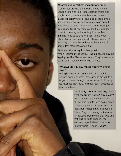
- Main body of text
- Clearly depicted questions
- A pull quote from the article itself
- Two main images
- A similar/relevant colour scheme
The colour scheme isn't bright and bold like my cover and contents page, I did this on purpose as I wanted the main point of interest from the viewer to be the image, as using this colour scheme it is clearly depicted and presented well. It stands out from the background and will contrast with the rest of the magazine, this is in order to grab the readers attention as they are flicking through the pages quickly because it is the main article in the entire magazine. I wanted the font to sort of contrast this and be rather subtle and not outstanding as to reflect the mood of this article.
I think this uses many elements to which a regular rap magazine would consist of in the real world, and these all pull together to form a respectable collection of magazine pages using all regular conventions of a media magazine product that both speak and appeal to the target audience and convey the genre of UK grime and rap.


